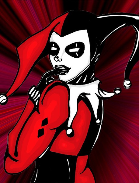
I like how you drew her face and I like Harley's pose. I think the muscles on her arm is a little off. I would have also chosen different colors for the background (that's easily fixed, just colorize it to make it red.)
The lines are too unsure in several places, the anatomy is really off, the sading is not good and wrong. The colorss of the background are not working together with the red in the foreground. The idea is good, but I'm sorry to say this: it's poorly done. I'd really like to see an overworked version of this, though :) Put more time to it and more attention to detail, and I'm sure it will turn out good, because the concept itself is good :)
5 of 8 Comments Show All 8 Comments
Cynthia J 22 Aug 2004
I like how you drew her face and I like Harley's pose. I think the muscles on her arm is a little off. I would have also chosen different colors for the background (that's easily fixed, just colorize it to make it red.)matt g 31 Jul 2004
woah, Batman?Jessica Evans 31 Jul 2004
nice, I like the background, nice coloring alsoHeike Andresen 31 Jul 2004
The lines are too unsure in several places, the anatomy is really off, the sading is not good and wrong. The colorss of the background are not working together with the red in the foreground. The idea is good, but I'm sorry to say this: it's poorly done. I'd really like to see an overworked version of this, though :) Put more time to it and more attention to detail, and I'm sure it will turn out good, because the concept itself is good :)Paul Traudt 31 Jul 2004
like it , color , comp very cool