- Tamara Beloved
- View Portfolio
- Image 34 of 41
- Added 06 Nov 2003
- 1347 Views
- 13 Comments
- Share This Image On...
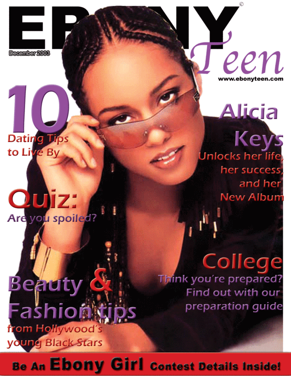
this is a class assignment i just did...if you are familiar with Ebony magazine then you should see that I followed their style. This magazine doesnt exist though.
5 of 13 Comments Show All 13 Comments
Maddison Jamison 28 Apr 2006
It may not exist but it's a great front-cover and I would believe it was real if you hadn't said it's not. Very professional-looking!Tamara Paylor 16 Jan 2004
i only used 2 fonts...just different effects on the same font...thanksAmy Pye 16 Jan 2004
I think this does look professional but I also think that the bevel could have been avoided and less fonts could have been used. I can understand the title being a bit covered, big mags like Cosmo do that quite often. Nice layoutTamara Paylor 22 Dec 2003
thanks for the comments...and as far as grades my teachers who all work in the industry all have given my A's on my work...i maintain a 4.0 GPA...thanks :)Melissa Rinaldi 22 Dec 2003
Still think if fonts were less..like I said, and I did look at EBONY cover, heres a link. The cover is well dony, likes like basically 90% of covers, simple serif fonts, caps used in title, and in others. Still diff from yours. But like your a little hidden :)