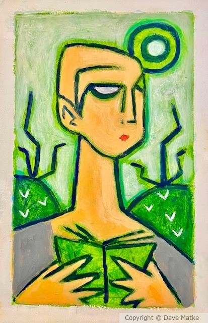
And greens are good for you, Dave. Lost his place in the book, has he? Well, he'd better watch out for the encroaching vegetation. Minimal to great effect, I'd say. Colors snap, crackle and pop. :)
Artist Reply: Thanks, Charles ... I like how it came out ... using pythalo blue + yellow , white , also primary blue and yellow .
I'm sure you remember using a map or Thomas guide : ) Certainly used that while driving to California , No cell phones yet hahaha ! and way more fun : )
3 Comments
John Rembert Jones 1 hour ago
You're in the groove Dave. The blue is a good choice to compliment the green tones. Take care.Charles Jones 8 hours ago
And greens are good for you, Dave. Lost his place in the book, has he? Well, he'd better watch out for the encroaching vegetation. Minimal to great effect, I'd say. Colors snap, crackle and pop. :)Joanie Holliday 9 hours ago
NICELY DONE DAVE. GREAT GREENS.