- Tori Crossman
- View Portfolio
- Image 4 of 7
- Added 10 Oct 2003
- 113 Views
- 1 Comment
- Share This Image On...
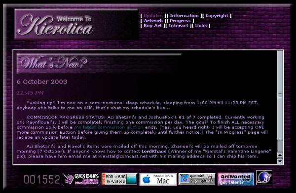
To debut in November. Going back to my infamous "Dark Side" for this layout. I read an article about how it's better for your eyes to read light text on dark backgrounds, which brought me ultimate joy. I was kind of growing out of my "Lilac" phase, anyway.
1 Comment
Sarah-Lynn Brown 07 Nov 2003
Love the colors of purple. the pale letters really bounce off the page. Clean design