- Emilio Bandera
- View Portfolio
- Image 165 of 208
- Added 14 Feb 2006
- 178 Views
- 1 Comment
- Share This Image On...
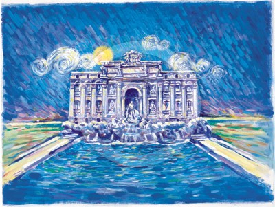
This particular series of paintings was used for outdoor store signage. Not to my liking the client wanted a lot of blue, lot of blue. The whole theme was a yellow sun and a lot of Mediteranean blue. These images were not used as you see them. There was a lot of image croping involved. You can see the croped images on my page 1. These are not my favourite pieces by the way, but they do have a different look when they are cropped for their usage purpose. The client depicted this particular style.
1 Comment
Cathie Brock 15 Feb 2006
Wonderful Emilio...All the best Cath